Heatmap Report
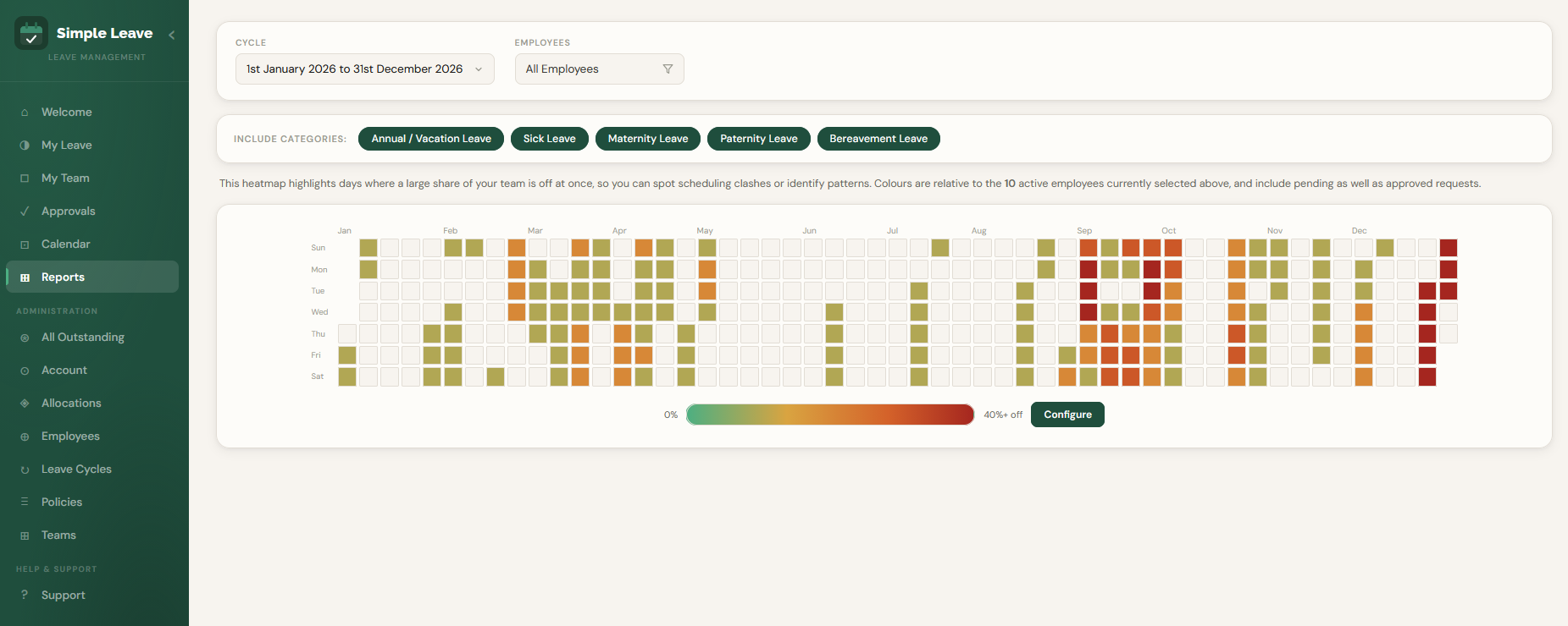
Heatmaps give you an instant visual overview of where leave is concentrated across your business, making it easy to spot busy periods at a glance.
They're useful for forward planning — helping you identify potential gaps in availability and plan cover — as well as looking back at historical leave patterns and trends.
Who Can View This Report
- Administrators see all active employees in the organisation.
- Managers see their direct reports.
- Employees without admin or manager access cannot view this report.
There's no "Include Inactive Employees" option here — inactive employees are always excluded automatically.
Filtering the Report
- Cycle — choose which leave cycle to report on.
- Employees — click the filter button to narrow the heatmap down to specific employees or teams.
- Include Categories — the pills above the heatmap let you merge or exclude specific leave categories from the count. For example, untick Sick Leave if you only want to see the impact of planned annual leave.
Every included category is merged into a single heatmap rather than shown separately. An employee with two different types of leave logged on the same day is only counted once for that day.
Reading the Colours
Each cell represents one day, coloured on a scale from green (nobody off) through to red, based on what percentage of your currently selected employees are off that day.
Colours are relative to whoever is currently selected above — the same day can look different depending on which employees or team you've filtered to, since the percentage is always "off" divided by "selected", not a fixed organisation-wide headcount.
Both approved and pending requests count toward a day's total, so you can catch a potential clash while it's still awaiting approval, rather than only after it's confirmed.
Viewing Who's Off
Hover over any coloured day to see how many people are off and what percentage of your selected employees that represents.
Click on a day to open a popup listing everyone off on that date, grouped by leave category — so you can see at a glance whether a clash is, for example, several people on Annual Leave together, or a mix of different leave types.
Configuring the Red Threshold
The gradient bar underneath the heatmap shows what percentage of employees off is needed for a day to render at full red — 30% by default. Click Configure to adjust it:
- Drag the slider (or use the +/- buttons) to the percentage you want to try.
- Click Refresh to preview the heatmap recoloured at that value. This doesn't save anything — it's just a preview.
- If you're happy with it, click Save (administrators only) to make it the new default for everyone in your organisation.
Only administrators can save a new threshold. Managers can still preview different values to explore the data, but the change won't persist.
Related Pages
- Teams — group employees into teams to filter the heatmap by.
- Leave Policies — how leave categories are configured.